Mobile-First Layout That Ships: How PrimaryLayout Solves Real UX Problems
Most of your readers are on phones. That's not an opinion - it's what the analytics say for virtually every content site. If mobile feels like a second-class experience, you're losing people before they finish a single article. But hiring a UX team or adopting a component library to solve basic layout problems is expensive overkill for a small operation.
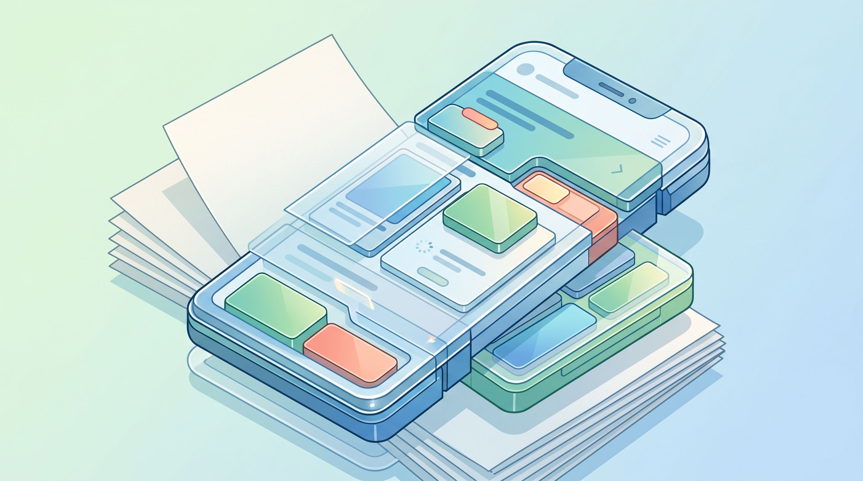
PrimaryLayout is a single custom element that handles the hard parts of mobile reading UX: fixed-header offsets, safe-area insets, recommendation card interactions, and loading feedback. It works alongside HTMX for navigation (see the architecture overview) and keeps the total JavaScript budget well under control (more on that in The Minimal JavaScript Approach).
The problem: content hiding behind fixed headers
A fixed header keeps navigation accessible on every scroll, but it causes content to slide underneath whenever HTMX swaps fire. The typical fix - adding top padding to every page template - is fragile and creates coupling between the header height and every template in the system.
Instead, I baked the offset directly into PrimaryLayout:
.pl-container {
          padding-top: 56px;
        }
        .pl-main-spacer,
        .pl-nav-spacer,
        .pl-aside-spacer {
          flex: 0 0 56px;
          height: 56px;
        }
Those spacers live inside the custom element's shadow DOM. The rest of the site doesn't know or care about the header height - PrimaryLayout owns that detail. When HTMX finishes swapping in a new article, the layout's scrollMainToTop() method resets the scroll position so the reader starts at the top with no jarring jump.
This is the kind of encapsulation that pays off over time. Change the header height once, in one place, and every page just works.
Safe-area insets: respecting the hardware
Phones with gesture bars (iOS) or navigation pills (Android) can easily overlap bottom-positioned UI elements. This is the kind of bug that's invisible in desktop testing and infuriating to real users.
.pl-main,
        .pl-mobile-recs {
          padding-bottom: calc(0.5rem + env(safe-area-inset-bottom));
        }
The env() function grabs the device's safe-area inset at render time, so the mobile "Show more" button always sits above the nav bar. No hardcoded pixel values, no device-specific hacks. One line of CSS that works on every phone.
Recommendation cards that feel native
Recommended articles need to work seamlessly on both desktop and mobile without duplicating logic. The static build process generates two containers (#desktop-recs and #mobile-recs), and PrimaryLayout exposes slots for each. HTMX's out-of-band swaps (hx-swap-oob) refresh both containers whenever a reader loads a new article - the card you just tapped disappears and the list repopulates without a full reload.
The interactions are designed to feel instant:
- Each card listens for
hx-on::before-requestand immediately adds apl-recommend-hiddenclass, fading the card out on tap. - The class drops opacity, height, and pointer events in one transition, preventing accidental double-clicks.
- The "Show more" button matches the card styling (small caps, subtle hover) so it reads as part of the list, not a bolted-on afterthought.
These are small details, but they're the difference between a site that feels like a web page and one that feels like a product.
Loading feedback without a skeleton screen
Full-page skeleton screens are a well-known pattern, but they're overkill for a content site where navigations take 100-300ms. Instead, I embedded a progress bar directly under the header:
<header class="pl-header">
          <div class="pl-header-container">...</div>
          <div class="pl-progress-line" aria-hidden="true"></div>
        </header>
The layout hooks into HTMX lifecycle events to manage the bar's state:
document.body.addEventListener('htmx:beforeRequest', (event) => {
          withLayout(event.detail, (layout) => layout.setLoading(true));
        });
        document.body.addEventListener('htmx:beforeSwap', (event) => {
          withLayout(event.detail, (layout) => layout.setLoading(false));
        });
setLoading(true) triggers a pulse animation; setLoading(false) fades it out so the bar never lingers. Because the bar lives inside the custom element, I can change the gradient, the height, or the animation without touching a single page template.
Scroll-to-top that doesn't break on navigation
Early versions tried to scroll the <article> element directly, which broke whenever HTMX replaced the node. The current approach is simpler: the layout exposes scrollMainToTop(), and an htmx:afterSwap listener calls it as soon as new content arrives. Readers always land at the start of the article, even after tapping through several recommendation cards.
Why this matters for small teams
The real value of PrimaryLayout isn't the code - it's the decision surface area it eliminates. Safe-area padding, header offsets, loading indicators, scroll management: these are problems you solve once, encapsulate in a component, and never think about again. Every hour not spent debugging mobile layout quirks is an hour spent writing content, building features, or talking to users.
For the analytics side of understanding how readers interact with this layout, see Zero-Server Analytics. For the full architecture that ties these pieces together, there's How This Blog Works.
What's next
I'm testing two additions:
- Highlighting the currently viewed card in the recommendation list so readers can orient themselves after navigating.
- A "back to top" affordance for long-form posts - but only if it can ship without meaningfully increasing the JavaScript footprint.
Until then, PrimaryLayout keeps doing the quiet work: respecting safe areas, coordinating HTMX swaps, and making every page feel like it was built for phones first - because it was.